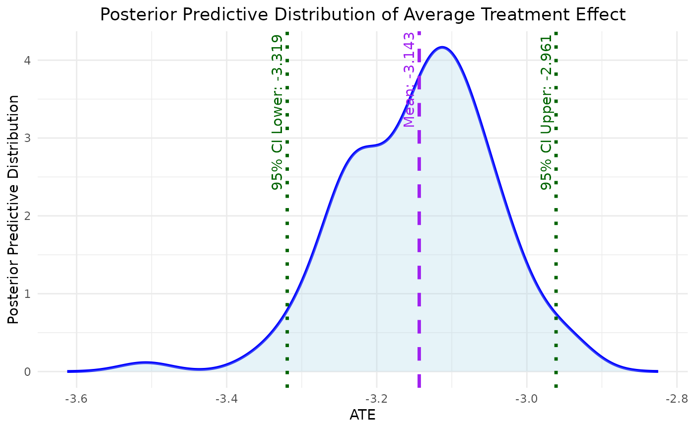
This function plots the density of ATE from bayesmsm output.
Usage
plot_ATE(
  input,
  ATE = "RD",
  col_density = "blue",
  fill_density = "lightblue",
  main = "Posterior Predictive Distribution of Average Treatment Effect",
  xlab = "ATE",
  ylab = "Posterior Predictive Distribution",
  xlim = NULL,
  ylim = NULL,
  ...
)
Arguments
- input
A model object, data frame or vector containing the bootstrap estimates of ATE.
- ATE
define causal estimand of interest from RD, OR, RR.
- col_density
Color for the density plot (default is "blue").
- fill_density
Fill color for the density plot (default is "lightblue").
- main
Title of the plot (default is "Density of ATE Estimates").
- xlab
X-axis label (default is "ATE").
- ylab
Y-axis label (default is "Density").
- xlim
Limits for the x-axis (default is NULL).
- ylim
Limits for the y-axis (default is NULL).
- ...
Additional graphical parameters passed to the plot function.
Value
A ggplot object representing the density plot for the posterior predictive distribution of the Average Treatment Effect (ATE).
Examples
# 1) Specify simple treatment‐assignment models
amodel <- list(
  c("(Intercept)" =  0, "L1_1" =  0.5, "L2_1" = -0.5),
  c("(Intercept)" =  0, "L1_2" =  0.5, "L2_2" = -0.5, "A_prev" = 0.3)
)
# 2) Specify a continuous‐outcome model
ymodel <- c("(Intercept)" = 0,
            "A1"         = 0.2,
            "A2"         = 0.3,
            "L1_2"       = 0.1,
            "L2_2"       = -0.1)
# 3) Simulate without right‐censoring
testdata <- simData(
  n                = 200,
  n_visits         = 2,
  covariate_counts = c(2, 2),
  amodel           = amodel,
  ymodel           = ymodel,
  y_type           = "continuous",
  right_censor     = FALSE,
  seed             = 123)
model <- bayesmsm(ymodel = Y ~ A1 + A2,
                  nvisit = 2,
                  reference = c(rep(0,2)),
                  comparator = c(rep(1,2)),
                  treatment_effect_type = "sq",
                  family = "binomial",
                  data = testdata,
                  wmean = rep(1,200),
                  nboot = 10,
                  optim_method = "BFGS",
                  seed = 890123,
                  parallel = FALSE)
plot_ATE(model)